


Open Harmony State Management
An easy-to-follow guide for beginners looking to manage component state in OpenHarmony with ArkTS.

Introduction
State management is key to building reliable and efficient applications in declarative Frameworks. In declarative frameworks like Open Harmony, it manages dynamic data affecting the UI, ensuring consistent performance and reliability.
Effective state management ensures UI components reflect the latest data, providing a responsive user experience. This is particularly important in IoT environments, where components must interact in real-time and maintain data consistency.

In Open Harmony and ArkTS, there are two main types of state management: Component State and Application State. Component state deals with data local to specific UI elements, while application state manages data shared across multiple components of an application.
In this article, we will focus on component state management and explore how it impacts Open Harmony development, covering best practices, practical examples, and common challenges to help developers optimize their applications effectively.
What Is Component State in Open Harmony?
Component state in Open Harmony is simply the data that controls what a specific UI element looks like and how it behaves at any given time. In declarative frameworks like Open Harmony, the UI is directly linked to this state, meaning any change in state automatically updates the UI.
In Open Harmony, each component has its own state, which simplifies complex user interfaces by breaking them down into smaller, manageable parts. Managing this state effectively helps create responsive apps that adapt smoothly to user interactions and system events.
Decorations In ArkTS
Decorations are a concept used in programming languages to add extra functionality or styles to components without modifying their core logic. In ArkTS, you can define your state within components using decorators. These decorators help ArkTS listen to variable changes and automatically update the UI whenever changes occur, keeping the interface responsive and synchronized with the underlying data.

From Theory to Practice
Now that we've covered the key concepts, let's dive into some practical coding. We'll explore component state management by focusing on these important decorators:
@State: Used to manage local state within a component.
@Prop: Allows passing data from a parent component to a child component.
@Link: Establishes a two-way data binding between components.
@Provide/@Consume: Shares data across components without explicit prop drilling.
@Observed: Monitors changes in a variable and updates the UI accordingly.
@ObjectLink: Connects an object reference to the component state for synchronization.
Let's start our journey with @State decoration.
@State
An @State variable is used to manage local state within a component. It directly affects how the UI looks and behaves, and when the state changes, the UI updates automatically.
The @State decorator makes variables reactive, meaning any change will cause the component to re-render.
@State variables are private and can only be accessed within the component. They must be initialized locally and cannot be directly set by the parent component.
Let's look at an example to better understand how @State works:
@Entry
@Component
struct CounterApp {
  count: number = 0; // Simple Variable

  build() {
    Column() {
      // Display the current count
      Text(`Count: ${this.count}`)
        .fontSize(32)
        .margin({ bottom: 100 });

      // Increment button
      Button('Increment')
        .onClick(() => {
          this.count += 1;
        })
        .margin({ bottom: 10 });

      // Decrement button
      Button('Decrement')
        .onClick(() => {
          if (this.count > 0) {
            this.count -= 1;
          }
        })

    }
    .height('100%')
    .width('100%')
    .padding(20)
    .justifyContent(FlexAlign.Center)
  }
}
In the above example, the component CounterApp uses a simple variable count to manage the count value. However, because count is a simple variable, changes to count will not trigger the UI to re-render. This is why when you click the increment or decrement buttons, the value of count changes internally, but the UI does not update to reflect the new value.
To ensure the UI is updated whenever count changes, we need to use the @State decorator to make count a reactive state variable. By doing this, any changes to count will automatically refresh the UI, ensuring the displayed value is always in sync with the actual state.
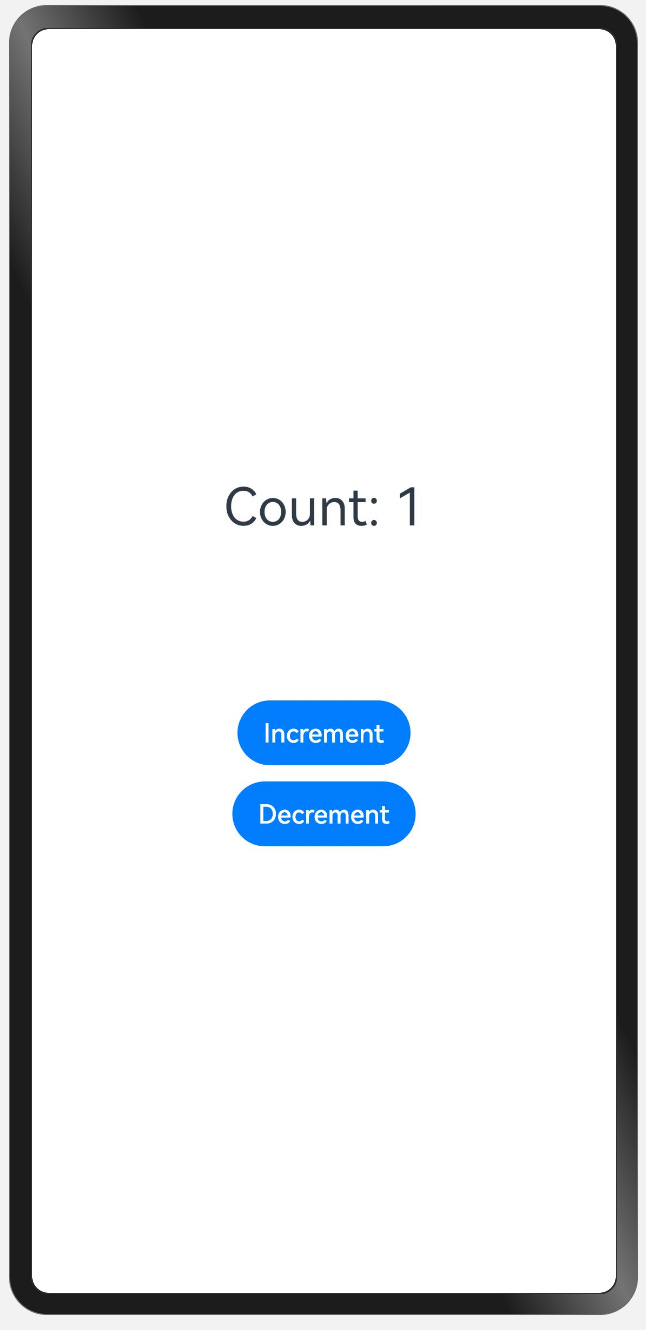
@Entry
@Component
struct CounterApp {
   @State count: number = 0;

   .
   .
   .

}
This was @State variable decoration. Remember, the @State decorator is the most basic state management tool in ArkTS. You use it to control the state of a component, and it's important to initialize it properly within the component
🤔 But what if we have multiple child components, and we need to pass our @State variable to them so they can update themselves based on changes to the state? Additionally, how can we allow child components to modify the state directly?
This is where @Link and @Prop decorators come into play.
@Link and @Prop
In OpenHarmony, you can use @Prop and @Link in child components to access and interact with an @State variable defined in a parent component:
@Prop: Allows a child component to read the value of an @State variable passed down from its parent, enabling a one-way data flow where the child can consume but not modify the state.
@Link: Connects the child component directly to the parent's @State variable, enabling two-way binding. This means the child component can both read and update the parent's state seamlessly.
In short, @Prop and @Link are tools to connect a child component to a parent's @State, offering flexibility in how data is shared and managed across components.
Let's see them in action with some example code:
@Entry
@Component
struct CounterApp {
  @State count: number = 0;

  build() {
    Column() {
      // Display the current count
      Text(`Count: ${this.count}`)
        .fontSize(32)
        .margin({ bottom: 20 });

      // Increment button
      Button('Increment')
        .onClick(() => {
          this.count += 1;
        })
        .margin({ bottom: 10 });

      // Child component using @Prop
      DisplayCountProp({ count: this.count });

      // Child component using @Link
      DisplayCountLink({ count: $count });
    }
    .height('100%')
    .width('100%')
    .padding(20)
    .justifyContent(FlexAlign.Center);
  }
}

@Component
struct DisplayCountProp {
  @Prop count: number;

  build() {
    Text(`Prop Count: ${this.count}`)
      .fontSize(24)
      .margin({ bottom: 10 });
  }
}

@Component
struct DisplayCountLink {
  @Link count: number;

  build() {
    Column() {
      Text(`Link Count: ${this.count}`)
        .fontSize(24)
        .margin({ bottom: 10 });

      Button('Increment from Child')
        .onClick(() => {
          this.count += 1;
        });
    }
  }
}
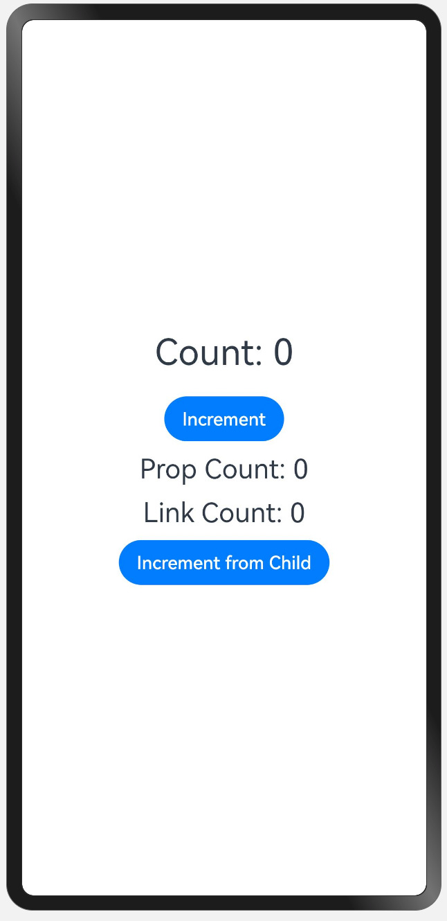
In the above example, the parent component (CounterApp) has a state variable count which is shared with two child components. The @Prop decorator allows DisplayCountProp to display the count value, whereas the @Link decorator allows DisplayCountLink to not only display but also modify the parent's count value.
If you remove @Prop from DisplayCountProp, the child component will no longer receive the count value from the parent, which means that the value will not be displayed or updated on the screen.
Without @Link, the DisplayCountLink component cannot modify the parent's count value, which means the 'Increment from Child' button will not have any effect on the parent component's state.
Note: Remember, when you decorate a variable with @Prop or @Link, you must initialize them through the constructor.
OK! Now we know about @State @Link @Prop but there is something missing right? What if we have a long component hierarchy? Should we pass states one by one ? Thats not really make sense?
@Provide and @Consume
In complex OpenHarmony applications, managing state across deeply nested components can become cumbersome if each level manually passes data down the hierarchy. To streamline this process, OpenHarmony introduces the @Provide and @Consume decorators in ArkTS.
@Provide: This decorator allows a component to offer a piece of state to all its descendant components, regardless of their depth in the component tree. By marking a state variable with @Provide, you make it accessible to any child component that chooses to consume it.
@Consume: This decorator enables a component to access and utilize a state provided by an ancestor. By using @Consume, a component can directly tap into the shared state without the need for intermediate components to pass it down explicitly.
By utilizing @Provide and @Consume, developers can efficiently manage state across complex component hierarchies, avoiding the need to send state to each child manually. This reduces code complexity and enhances maintainability.
@Entry
@Component
struct ParentComponent {
  @Provide count: number = 0;

  build() {
    Column() {
      // Display the current count
      Text(`Count: ${this.count}`)
        .fontSize(32)
        .margin({ bottom: 20 });

      // Increment button
      Button('Increment')
        .onClick(() => {
          this.count += 1;
        })
        .margin({ bottom: 10 });

      // Decrement button
      Button('Decrement')
        .onClick(() => {
          if (this.count > 0) {
            this.count -= 1;
          }
        })
        .margin({ bottom: 20 });

      // Child component
      ChildComponent();
    }
    .height('100%')
    .width('100%')
    .padding(20)
    .justifyContent(FlexAlign.Center);
  }
}

@Component
struct ChildComponent {
  build() {
    Column() {
      // Grandchild component
      GrandChildComponent();
    }
  }
}

@Component
struct GrandChildComponent {
  @Consume count: number;

  build() {
    Column() {
      // Display the consumed count
      Text(`Consumed Count: ${this.count}`)
        .fontSize(24)
        .margin({ bottom: 10 });

      // Button to increment count from grandchild component
      Button('Increment from Grandchild')
        .onClick(() => {
          this.count += 1;
        });
    }
  }
}
In this example, the ParentComponent uses @Provide to share a count state with all its descendants. It has buttons to increment or decrement the count.
The ChildComponent acts as a simple container, passing control to GrandChildComponent.
In GrandChildComponent, @Consume is used to access the count directly. It displays the count and has a button to increment it.
This setup shows how @Provide and @Consume efficiently manage shared state without needing to pass data through every component layer manually.
Alright, we've covered most types of state management components, but there's still one piece missing: @Observed and @ObjectLink. Let's move on to the next section to understand what challenges they address and how they can enhance our state management strategy.
Conclusion and Summary
This is it! We have come this far into this article, and this is a summary of what we learned.
State management in OpenHarmony and ArkTS can seem complex, but each decorator has a specific role that simplifies building responsive, interactive UIs.
Here is a quick summary of what we learned in this article:
@State: Use this when you need to manage local, reactive state within a component. It’s perfect for data that only affects one component and ensures the UI updates automatically.
@Prop: Use this to pass data from a parent component to a child component, allowing the child to read it. This is a one-way data flow where the child cannot modify the parent’s state.
@Link: Use this when you need a two-way binding between parent and child components. This allows both the parent and child to update and reflect changes to the state.
@Provide/@Consume: Use these when you need to share state across multiple components in a complex hierarchy. @Provide shares a state variable, while @Consume allows any descendant to access it without passing it through each intermediate component.
@Observed: Use this for tracking changes to nested properties within an object. It ensures deep object changes are also observed, keeping your UI updated.
@ObjectLink: Use this for two-way binding with complex objects. Unlike @Prop, it maintains direct synchronization between components without copying, ensuring real-time data updates both ways.
In short, pick the decorator that best fits your needs:
For local state, use @State.
For one-way data flow, use @Prop.
For two-way data flow, use @Link or @ObjectLink.
For deep component hierarchies, use @Provide/@Consume.
For nested object changes, use @Observed.
By choosing the right decorator, you can manage your application state more effectively and create dynamic, responsive user interfaces with ease.