


Community Brings HarmonyOS Design Library to Figma for Native App Development

The development of HarmonyOS applications just got a boost with the introduction of an unofficial HarmonyOS Next Design Library on Figma. This community-driven initiative provides developers and designers with the tools needed to craft native HarmonyOS apps directly on the Figma platform, streamlining the process of designing user-friendly and visually appealing apps.
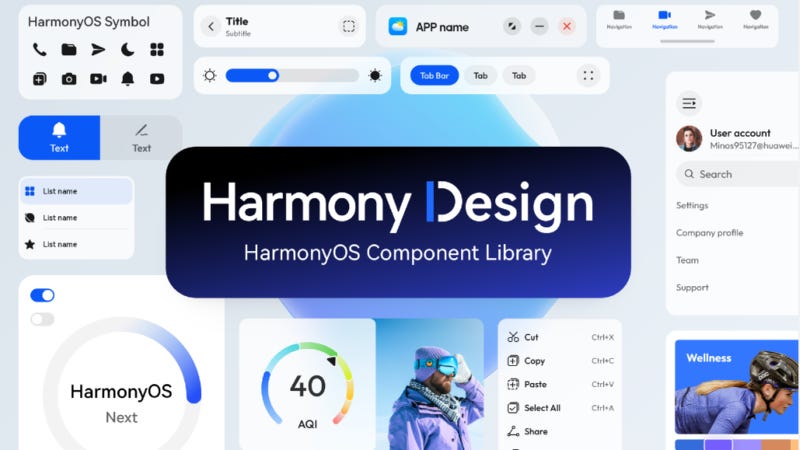
What’s Included?
The unofficial HarmonyOS design library offers a wide array of UI components tailored specifically for HarmonyOS applications. These assets include pre-designed elements such as buttons, navigation bars, icons, and layouts that comply with the visual standards and user experience guidelines set by HarmonyOS. By using these native elements, developers can ensure that their apps not only look and feel native to HarmonyOS but also align with Huawei's unique design language.
How to Use the HarmonyOS Design Library
For those new to Figma or HarmonyOS design, the library can be accessed by searching in Figma’s Community section or through links shared by the HarmonyOS design community. Users can duplicate the library to their workspace and start integrating HarmonyOS components directly into their designs.
What’s Next for the HarmonyOS Design Community?
As the HarmonyOS ecosystem expands, the design community may continue to add more components and tools to support the development of complex and sophisticated apps. This unofficial Figma library is just one example of how community contributions are making HarmonyOS more accessible, encouraging creativity and innovation within the developer community.